Scratching the surface of my bank's app login flow.
Summary: This is a short case study of the login and verification process of my bank app. It is a very lightly taken attempt of UX and UI improvements for this product. Every time I use this app my design mind wants to change it. So this is how I would do this.
Introduction
This is something that was growing inside me for some time. I wanted to start a series of articles where I could have some fun and target design patterns that drove my attention as a UX designer. I guess it is my professional divination, that I expect perfectly designed screens everywhere I go. I thought It would be fun to pretend I am the designer hired to improve the flows. My work is 100% fictional and I have full respect for the people who created pages that I will be reviewing. It is way easier to look at something built and suggest improvement than create something from the scratch with time, money and technical limitations. That said let's get to the review.
For today I want to share with you a login flow of my bank. I am using it for quite some time and every time I am log-in I have to follow the same verification process. Actually the page I am about to show you below inspired me to create this series. Hope you will enjoy it.
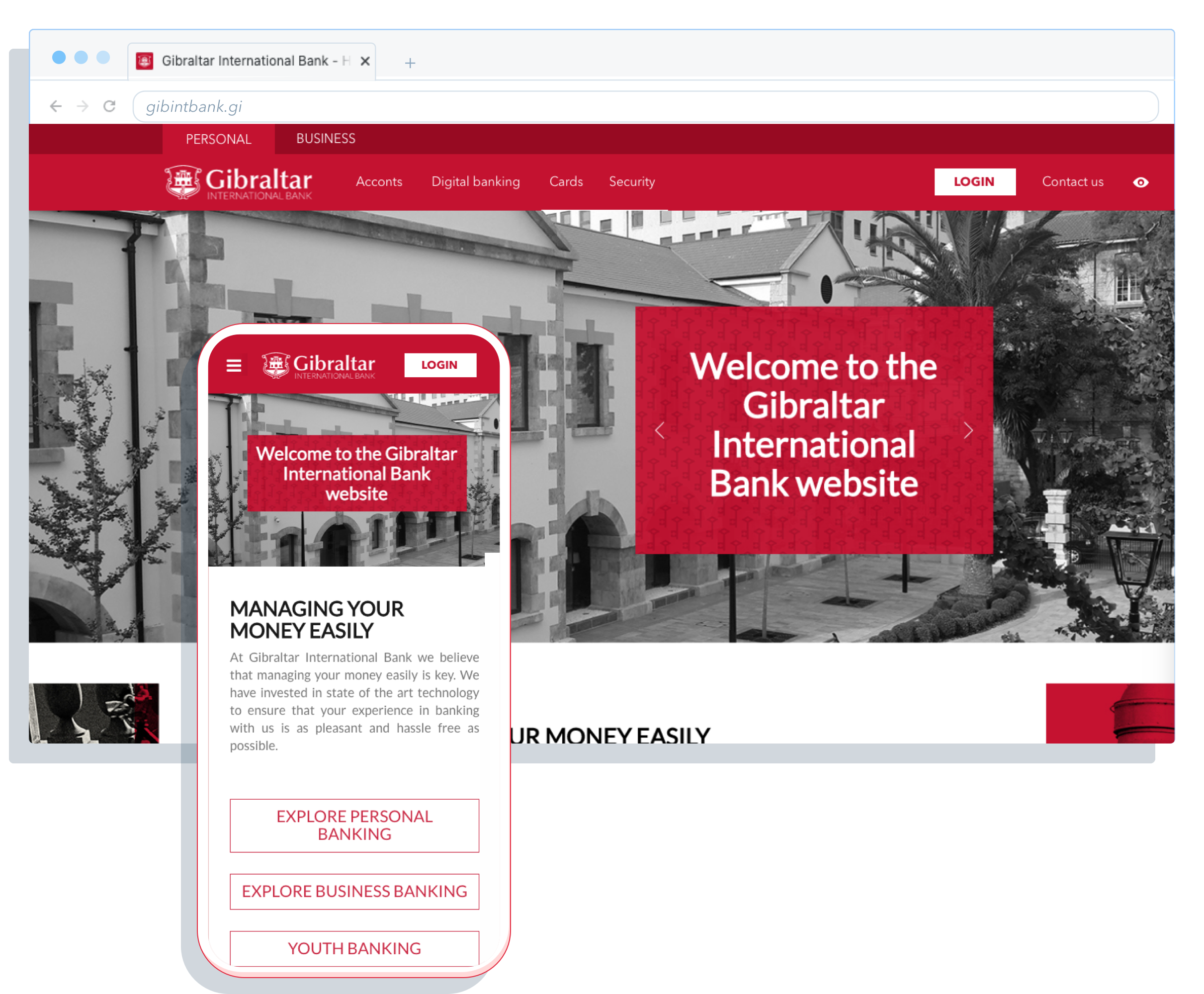
Home page
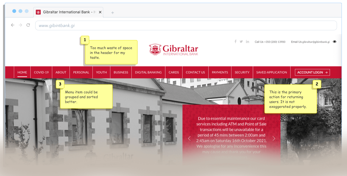
In this exercise, I will focus only on the home page header. It is a central element of this website and it is a starting point of most of all journeys. Especially the login journey that I want to cover today.
Fear of white space (Horror Vacui)
The headline is a joke of course 😀 The white space is a very positive and welcome design practice. It gives space and makes things more clear to the users. Many times people not related to design are afraid of this practice. They fear that this unused space will be wasted or if it is empty it means we should fill it. In this case, it is a bit different, we give lots of space for the bank logo that is nicely exposed but all the content is pushed down because of this decision.
My assumption here is: I would rearrange elements in the header and combine them with the menu bar. To have one line and get more space for messages that are below.
More about this phenomenon here: Wikipedia.org: Horror_vacui
Account Login button
This is the primary action for returning users. At the moment it blends with the menu items and can be easily skipped by the eye.
My assumption is: Button is not exposed properly. In my design, I will try to work on this area.
Menu Items overload
There are 13 items in the menu bar. It is simply too many. A good card sorting exercise should solve the problem. all we need to group them and we are good to go. for more context read about the Hick's law.
Home Page on mobile
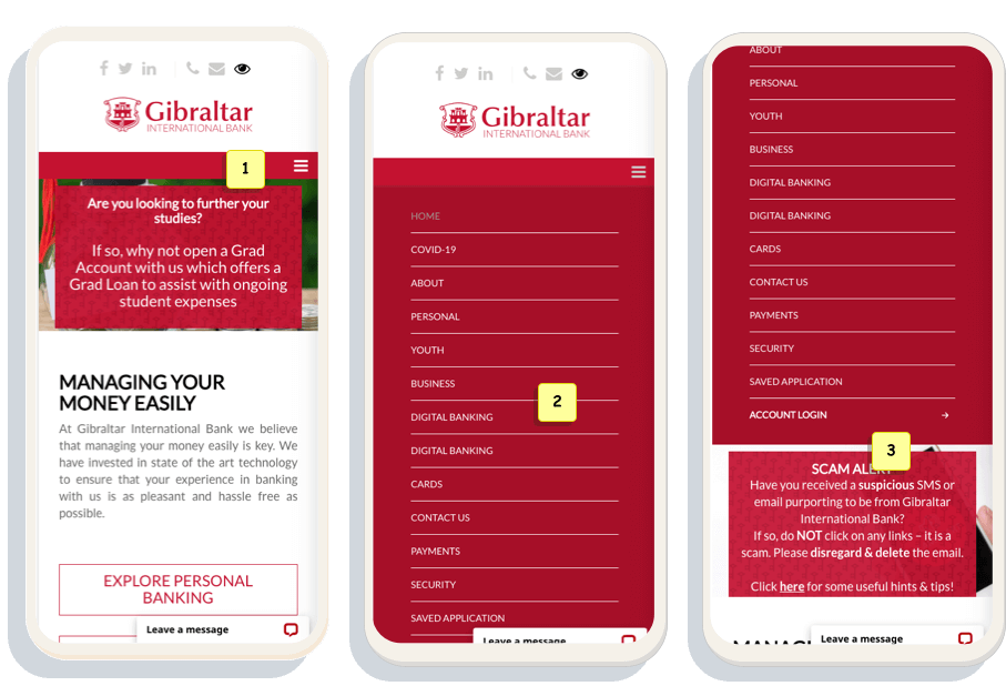
In this exercise, I will focus only on the home page header. It is a central element of this website and it is a starting point of most of all journeys. Especially the login journey that I want to cover today.
Hidden menu
Mobile screen in counter to the desktop view. We can't see any of the menu items because they are compacted in the burger menu. This type of implementation can make the experience inconvenient. It is harder for users to discover the items and especially the login button.
Paying design dept
Once we expand the menu we face another problem that is related to the number of options we have there. On desktop, all elements are visible however on mobile we experience a long list of items. In consequence, the login button is buried below the fold.
My assumption is: simple card sorting exercise would solve this issue. Grouping elements.
More about this card sorting here: Wikipedia.org: Card_sortign
Login button
In the end, the process of discovering the login button can be painful for some users. It is 3 actions away. Bringing it to the main screen would allow bank customers to get faster to their accounts and improve the experience.
The Login screen
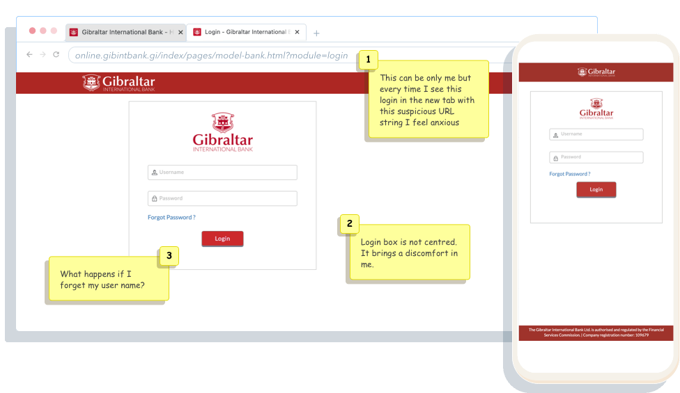
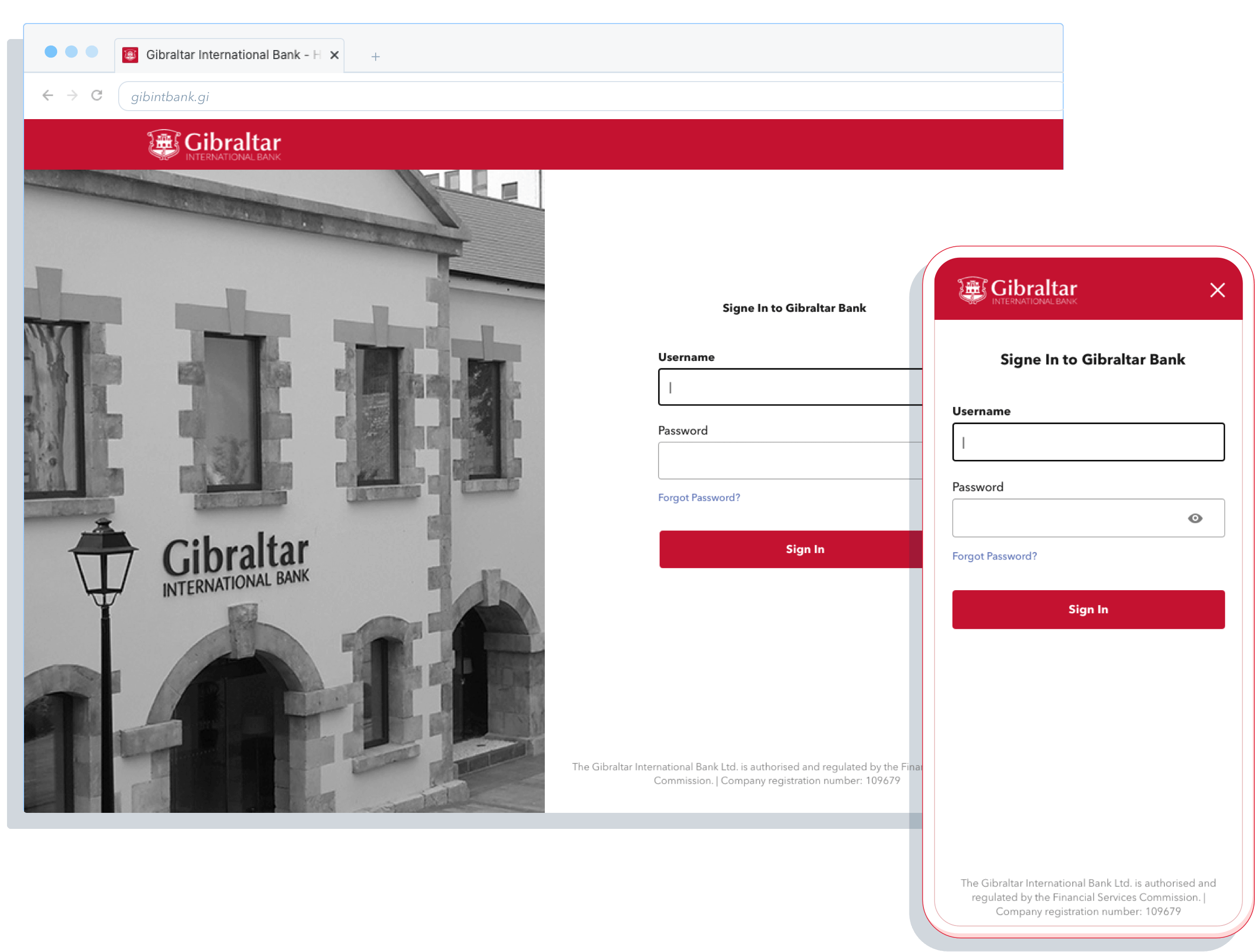
The next step on the journey is the login screen. It looks quite usual and nothing extraordinary here, only a couple of implementation issues. Bellow, I live a couple of comments on how to improve the screen with a couple of low hanging fruits.
Verification screen
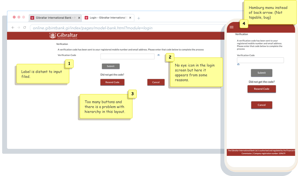
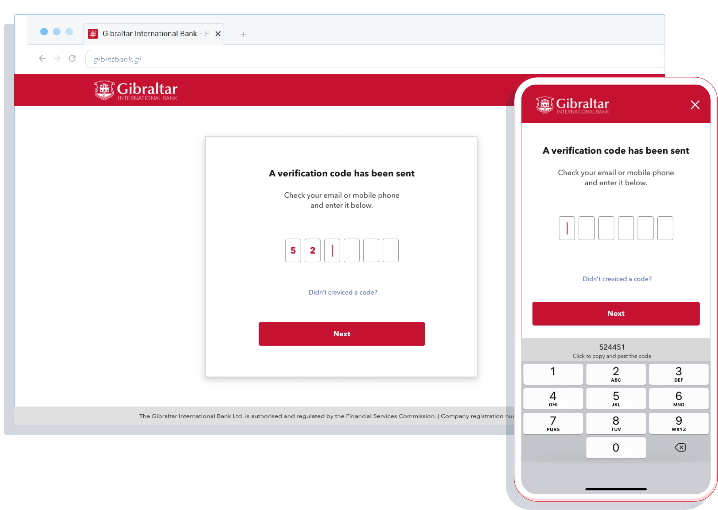
This screen is the reason I decided to redesign the journey and write this article. As a user and designer, this page always puzzled me. I am happy I can finally deconstruct it and fav little fun with it.
Eye Icon
First of all. why this icon is not present on the login screen? The second angle I want to take is that I am not sure we need it for the second verification after all. The code that should be used there is disposable, hiding the messages have not much sense. Lastly, icon placement especially on mobile is not well implemented.
The Buttons
I have a few things to say here:
- Having 3 buttons is not necessary and a bit too much. Easily we could get rid of the Cancel and replace it with a back arrow or X.
- Lack of balance and hiariachy. It is hard to see what it is the primary, secondary and tertiary action.
- The most important button is greyed out. This makes me wonder how many error click this caused on this website
UX/UI Improvments
On the main page, I redesigned the top menu. The main aim was to reduce the number of options available and put a strong emphasis on the login button. I separated menu options for business and personal clients. This way I was able to remove half of the menu items from the menu. Login button no is in contrast (white on red) to the top area and will be easier to notice for returning customers. The last thing that I changed in this concept is the amount of space the new menu bar is taking on the top. Previously version was too big and pushed other page elements down which was not an ideal solution.
A similar job was done on the mobile screen. I hid all the menu options under the hamburger menu. I am aware it is not the best UX approach however in this exercise this was the best option I could do. In the proper project reality, I would push for more research and design alternative option where more options would be visible on the page. For the sake of this concept, the hamburger menu will do.
The Login screen was not that bad in the initial version all it needed small ecstatic fixes. I centred it and added an extra branding bank feeling. In the native app, I would add a biometric way for login to skip this step. From the other small details, I added a hide/show password icon.
For the last verification screen, I had to redesign the whole page. On the original version content and inputs were very hard to follow. In my version, all content is centred and simplified. We have a clear button that indicates the next action required. For the verification code, I have added separate inputs filed to reduce the number of errors. In the mobile, we could use copy code from SMS automatically. In general, I was able to keep all the infrastructure of the page and make all much clearer for the end-user.
Summary
All the screens needed a small reshuffle to be more optimised. In many cases, it is like that. The low hanging fruits are out there, all we need to do is play a bit with the content and apply UX best practices. I want to add that this is only my interpretation and to validate this concept and usability testing would be required. All changes I did are based on my long design experience. My goal was to play with this concept and see if it would be possible to make a fix without drastic changes.
Extra thing:
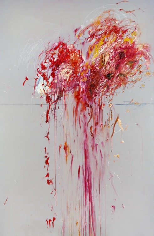
The colours pallet used for this article was inspired by the Cy Twombly painting Nine discourses on Commodus
Next Project
Mansion Cross NEwProject type

DAZNBetProject type

Leadership PrinciplesLeadership Approach

Teams RitualsLeadership Approach

How to build a great team?Leadership Approach
Design Leadership in ActionCase Study

Org TransformationLeadership Approach
MansionCase Study
MoPlayUX/UX Design
Sparc* Design SystemUX/UX Design
Save Your Plants AppUX/UX Design
MirrorUX/UX Design
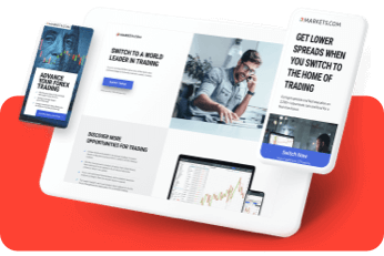
Visual System for Markets.comDesign system
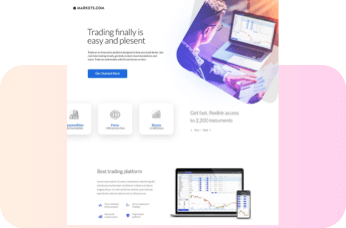
Dribbble ShotsProject type
HandsProject type
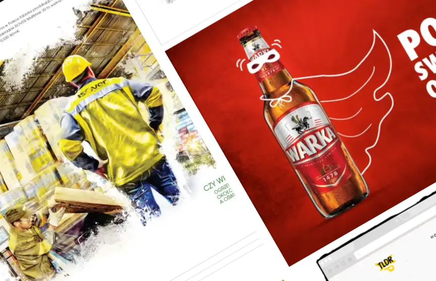
Blast from the pastProject type

