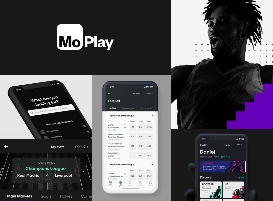
MoPlay App - Case Study
MoPlay was a fresh startup with an idea to revolutionize the sports betting industry. According to our analytics, 80% of the traffic was coming from mobile devices. We knew that the big provider will struggle with optimizing their huge websites for mobile we knew this was our chance. To build a mobile-first betting platform that will meet the needs of the modern user. I have joined the product team in 2019 with the help of my talented teammates we were able to produce significant improvements to the platform.
THE CHALLANGE
Project Scope
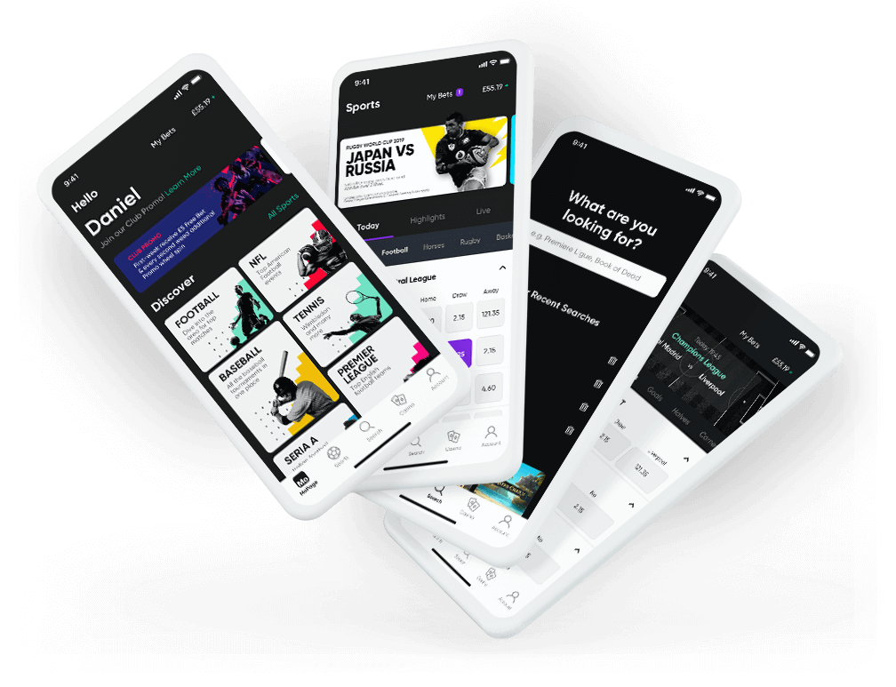
In this case study, I will present a process and design of proof of concept for the new look of our app. The main goal was to create clear and legible screens with a modern look. The second goal was to make content personalized for individual users.
Mobile / Desktop / Users reaserch / UX/UI Design
Audience
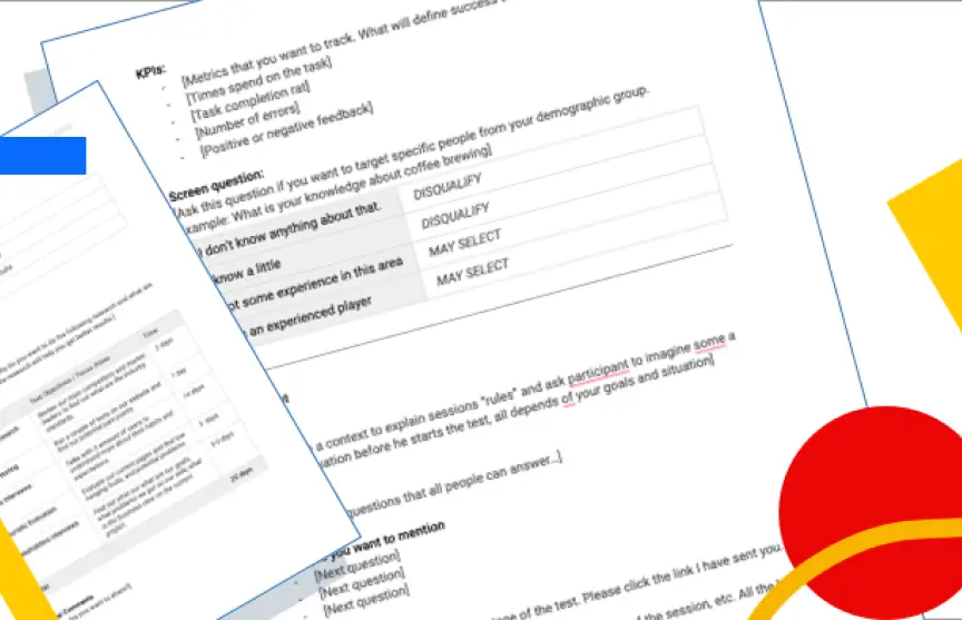
According to the users research, our targeted audience were millennials. (26-40). Tech-savvy people who use mobile phones and apps daily. Located all over the globe, the business goal was to spread to as many countries as possible.
Goal
The main goal was to create a clear and visually appealing app up to today's standers. In the first place, we wanted to give entertainment to our users and smooth performance.
Problem
The sportbetting industry is changing slowly and is persistent to changes. Sportbook websites are full of numbers and tables. It is hard to navigate in such an environment especially on the phone. It was our job to change it.
BASICS
Brand
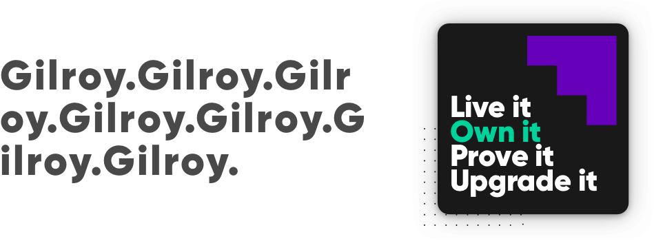
The brand was a cornerstone of the UI works. Brand tone of voice was bold, engaging and passionate. The main driver was that we wanted to change how people see the betting industry. To make something new fresh and safe. As a product team, we wanted to reflect that in our app.
Colours
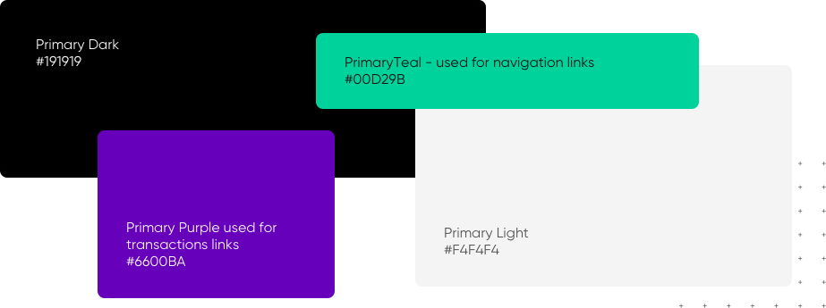
The main colours of the brand were black and white this combination allowed us to play with contrasts and emphasize the strong character of our product. As supportive and accent colours we decided to use teal for links and navigation. To differentiate the transaction action we used a strong purple colour.


HOME SCREEN
Personalonalized Page
Instead, send people straight to the ope see of a sportsbook tables view. We decided to create a safe bay. Home screen with the preferable sports shortcuts and recently played games. This screen was fully personalized. Based on users preferences and behaviours.
Personalization
Dou to the regulations every new user is verified. This gives us plenty of information for creating personalized content upfront.
Sport Grid
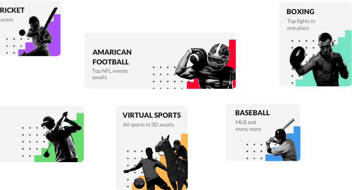
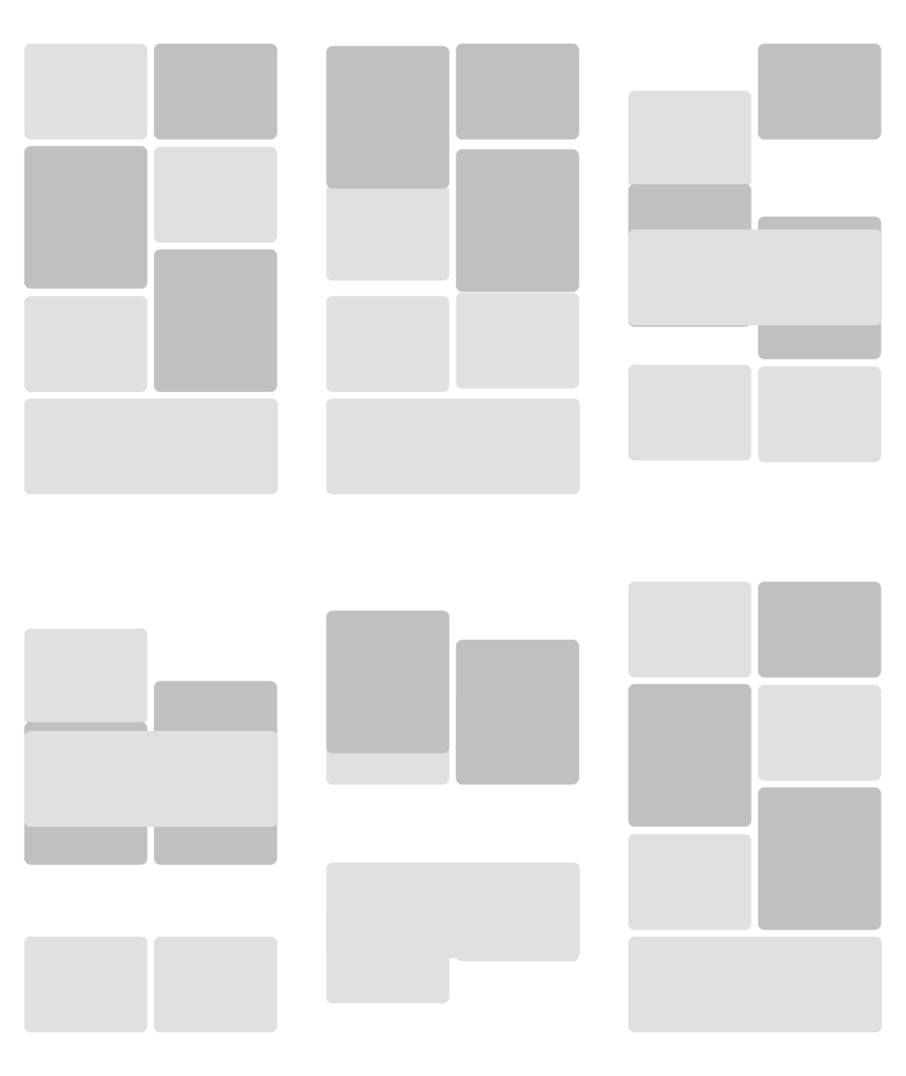
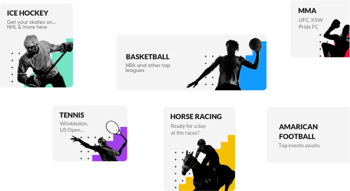
Sports grid was different for each person. Depending on their preferences. It was built from three different sized cards that could be rearranged. The bigger card the more likely it was selected in the past by the user.
Promotions
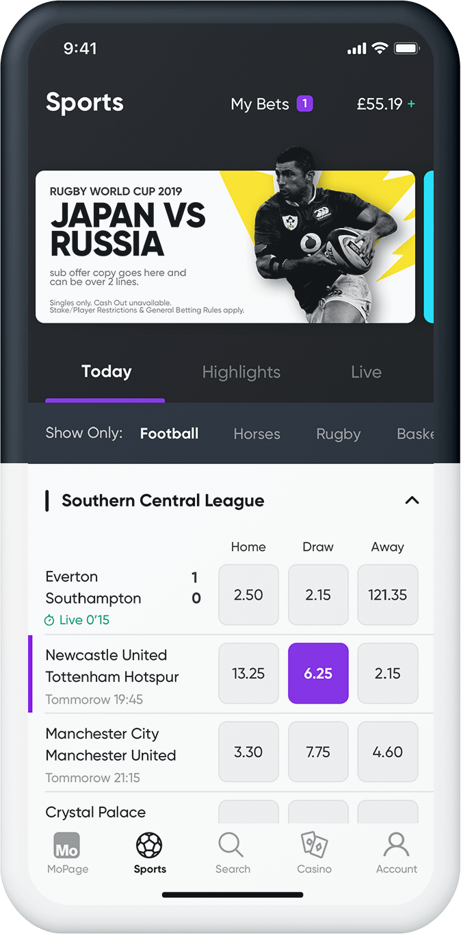
On the top, we added the promotion carousel with the latest and personalized promotions. We could offer a dedicated special offer to particular groups of our users.
Games
For customers that preferred to play our casino games in the meantime, we created fast track option for their favourite games
Sports Cards Grid
Each sports discipline was represented by an individual card in three sizes. This is an example of how the sports grid behaved. This approach gave us the freedom to personalize and make it unique to each user.
SPORT BOOK
Content Page
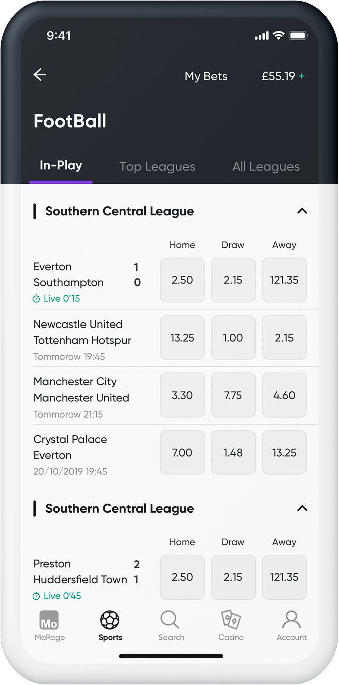
The heart of our app was the sportsbook page, this is a screen where all the magic happens. People use it to navigate through differents sports pages and look for betting opportunities. These types of pages are content heavy and suffered from an overload of information. I tried to find a balance between clarity and at the same time not hide valuable content from the users.
Clarity
All, not necessary elements were removed. I wanted to achieve the ascetic look where only typography, simple lines and spacing define the layout. The outcome of that is a layout filled with content but light looking.
Calculator look
One of the early inspirations I found was a calculator apps design. The tool that common and well design we don't even think about it. I wanted to translate this seamless feeling to our app where people can tap big price buttons with confidence and a similar experience.
Promotions
Promotions are an inseparable part of this industry. We as a team wanted to make them not intrusive. That's why we designed this element that would look rather like a card than a banner.
Transactions
Big buttons are not all. To highlight the selection we users spacial purple colour that was dedicated solely to this type of interaction.
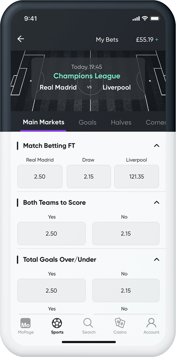
Desktop Version
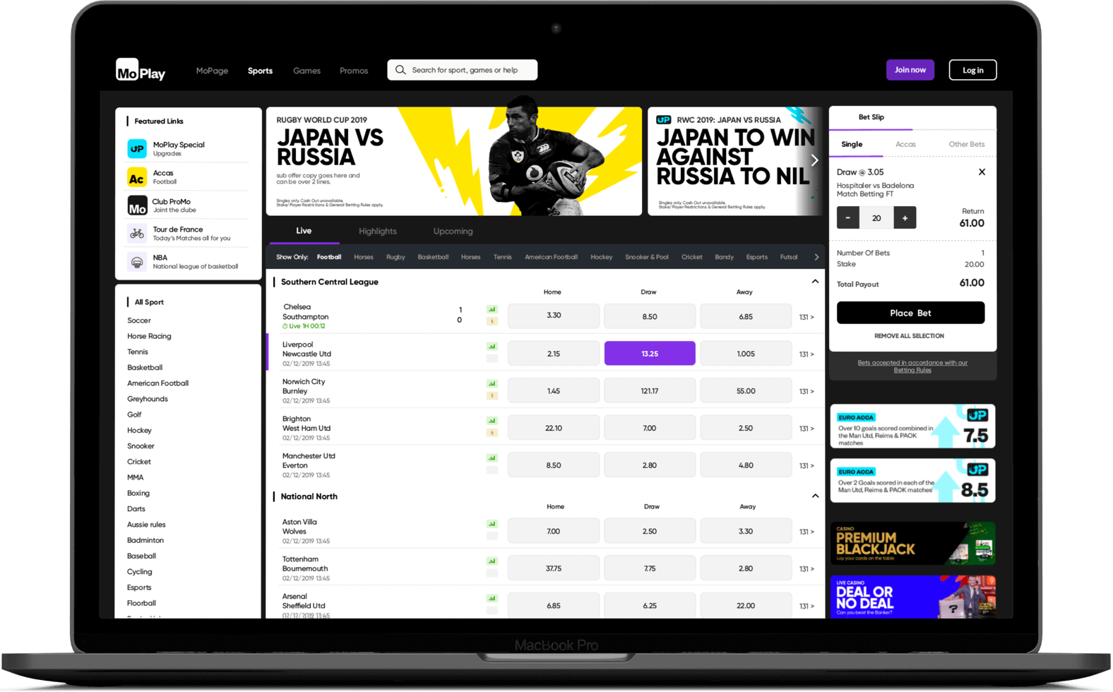
Part of this concept was to test how our designs would look on the bigger screen. 60% percent of our traffic was mobile users. We wanted to serve similar experience for the other 40% on desktops and tablets.
DISCOVERY
Search Page
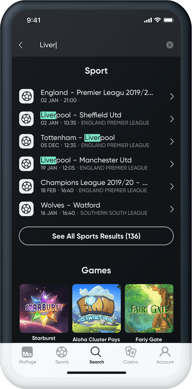
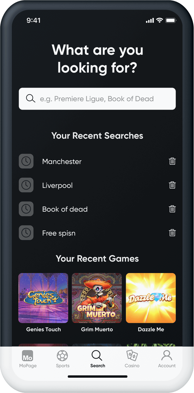
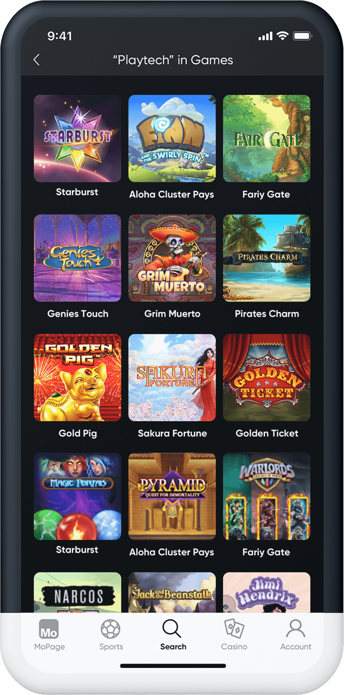
Our audience deserved a proper search engine that will allow them to search through thousands of sports events and explore our vast library of games. This was a week point of all other operators and our business strategy was to make the best search experience in our industry.
Clarity&Speed
Immediate results with auto-feel and search suggestions allowed that our search serve as a shortcut to different sections of our product.
All in One
Search showed results to sports events, games and help articles that hed answers to common problems.
Personalization
We used a personalization back end engine that allowed us to segment uses by their preferences. As the result, we could prioritize the results based on the users preferences. If a user were into games the query would show them first.
Black
We reversed the colour and use black as a background to highlight to the people that they entered search mode. Black was dominant confident same us our search straight to the point.
EPILOGUE
Summary
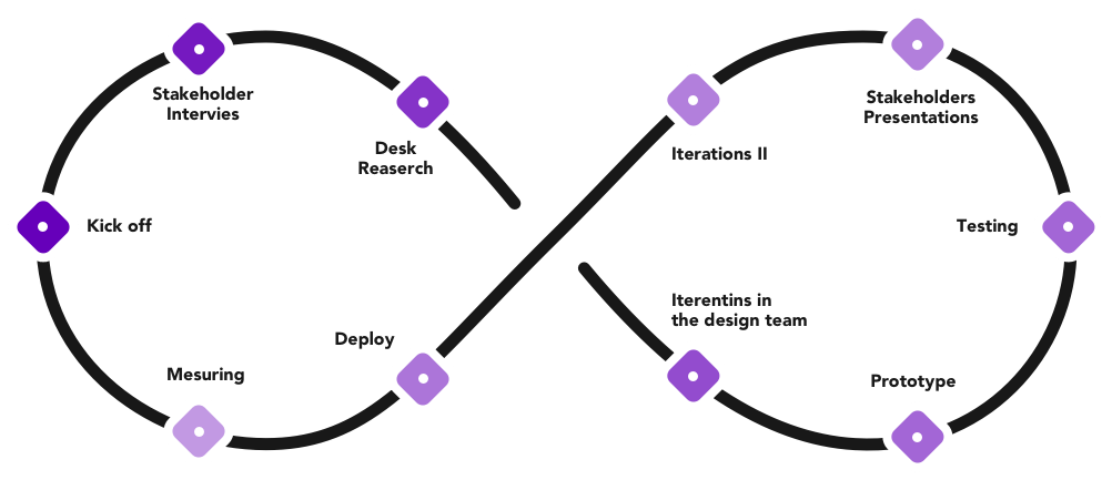
Working on this project took us almost one year. With all the research and backs and forwards. We learned tons of valuable lessons during that process. With this concept, we proved that sportsbook products can offer something more than just an incentive to attract customers. The gambling industry is now on the verge of change. Old fashion way to attract new customers is over. The first operator that will do the users-centred product will win and change the industry forever.
Thanks
I want to thank my teammates without their effort and hard work this project would never be as good as it is now. Each one of us showed diverse skills that complement other gaps. I know it was not always wall in a park but at the end results in speak for themselves. The best team I had the pleasure to work with!
Next Project
Mansion Cross NEwProject type
DAZNBetProject type
Leadership PrinciplesLeadership Approach
Teams RitualsLeadership Approach
How to build a great team?Leadership Approach
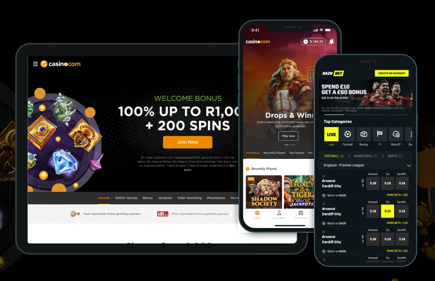
Design Leadership in ActionCase Study

Org TransformationLeadership Approach
MansionCase Study
Sparc* Design SystemUX/UX Design
Save Your Plants AppUX/UX Design
MirrorUX/UX Design
Visual System for Markets.comDesign system
Dribbble ShotsProject type
HandsProject type
Blast from the pastProject type

