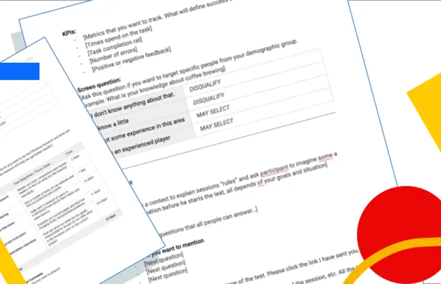
Sparc* Design System Case Stydy
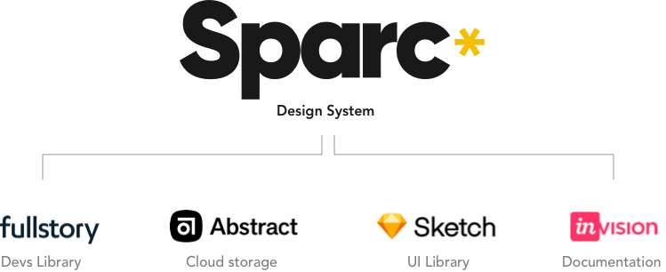
This is my story of how we started, build and pushed the design system idea in our organization. Without a huge team or budget. Powered only by our initiative, determination and perseverance.

THE CHALLENGE
What is MoPlay
MoPlay was a fresh startup with an idea to revolutionize the sports betting industry. Its inception was in mid-2017 and the first screens and research were made in Nov — 2017 with the intention of storming the world by surprise with awesome user experience and cutting edge UI.

Problems we had
A year ago when we started thinking about creating DS. The reason behind it was quite simple and easy to understand: we were growing — fast — and we were launching our product in different countries. So while we were growing, and doing more and more projects our design debt increased quite a lot, each designer tried to maintain their side tidy, but 10 minutes ad-hoc urgent projects didn’t help… Time to take a step back, and from scratch — making it consistent, several people will be very happy and will benefit from this project.
PREPARATION
There are no shortcuts
Like everything we do, we had to prepare a plan and research on this subject. We wanted to learn as much as we could and prepare ourselves for a long journey. There were no shortcuts and no silver bullets. Only hard work. We began scavenging for information on Design Systems.

User Interface audit
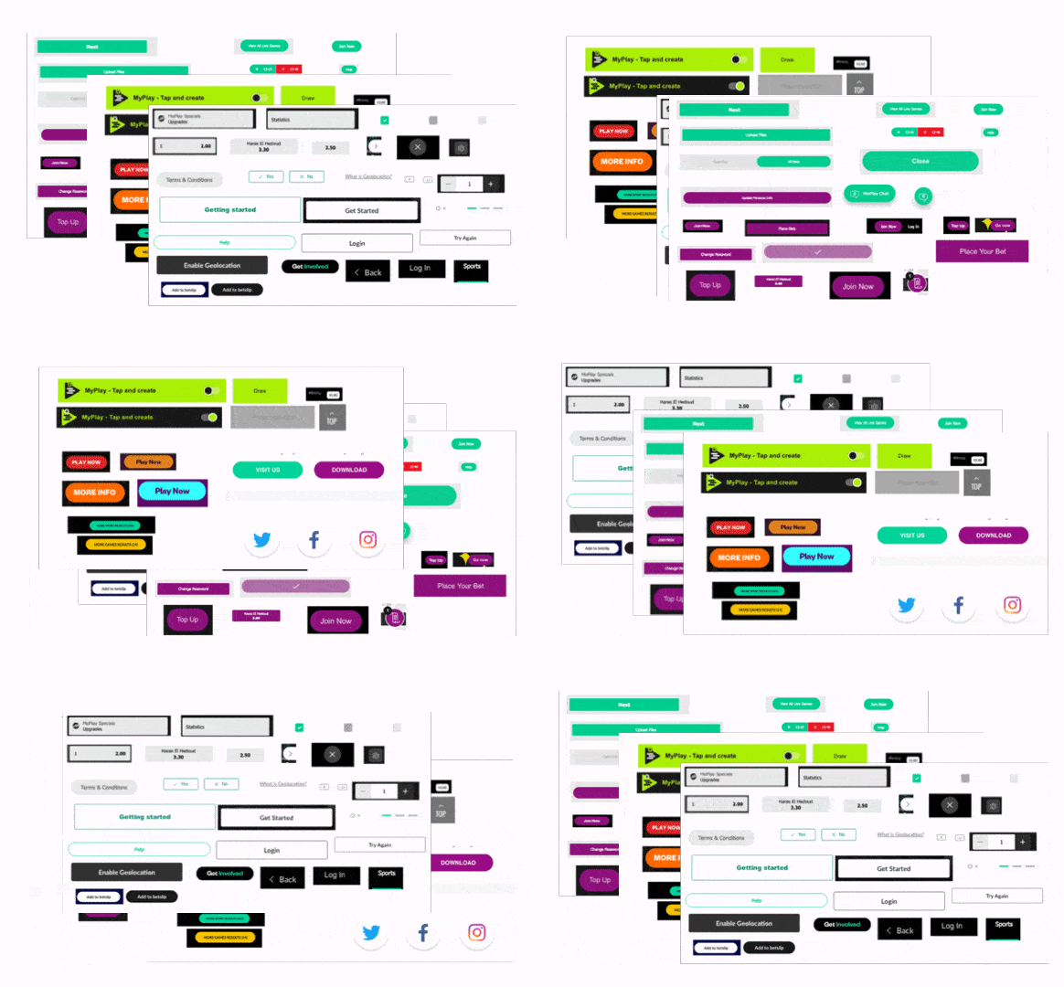
The plan was to take a snapshot of all the graphic elements we had, group them into categories and face the truth… there was no consistency.
For example, we place all our buttons next to each other and noticed that many details don't add up. In one button we used bold and others don't. Rounded corners had different parameters, and so on.
Workshop
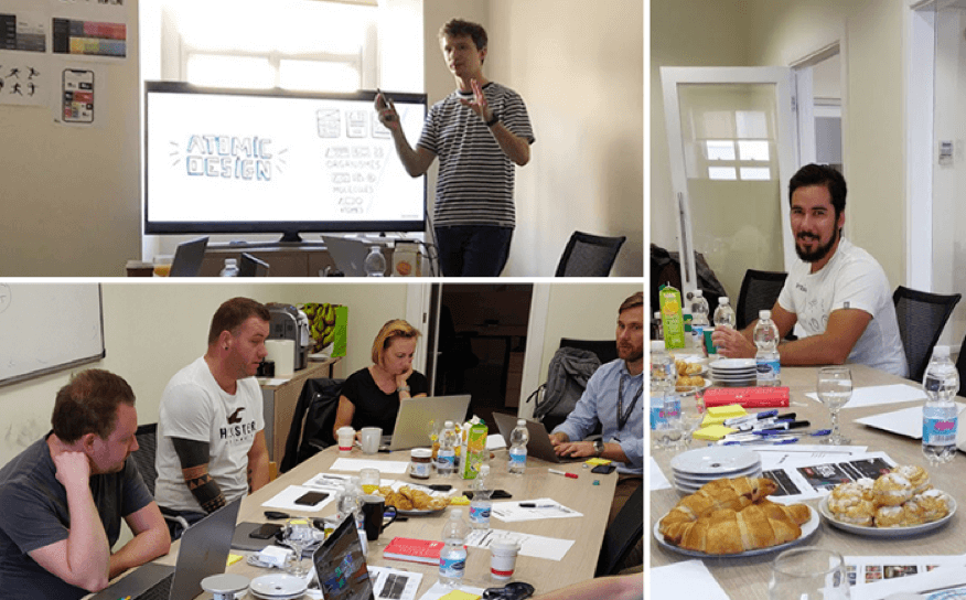
When we gathered all the necessary items from the audit we organized a workshop with all the designers to get our UI elements right. We went through them and discussed each aspect, how can we standardise our work and how the design system could help up achieve consistency.
During this session, the name for our DS was born. I knew that naming this project at the beginning was important. When you name a project it gets personality and people can envision it better. So we wrote down our name ideas and put them up to vote. Sparc* was a winner.
STRATEGY
North Star
It’s tempting to jump straight to your computer and start designing. But for such long projects like this, we needed to know how success looks like to set the right expectation for us and the company.
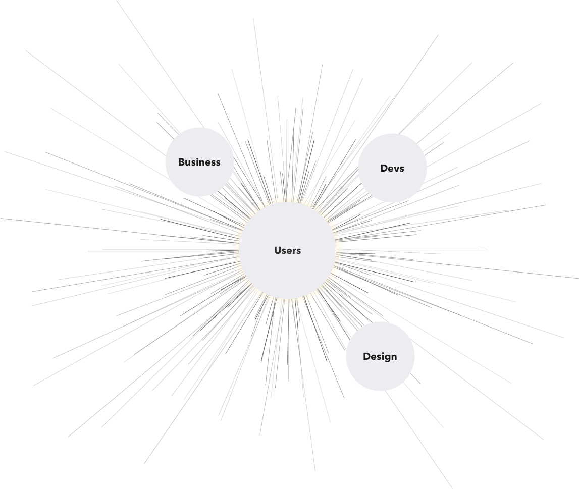
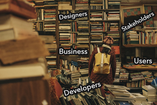
We selected 4 pillars of our design system. People who will benefit from it and what should they get from this initiative.
✴︎ Designers
Will work faster and more efficient, focusing on bigger problems the size of the button.
✴︎ Business
The design system will cut down costs and time of developing new features maintaining the quality.
✴︎ Users
Having consistent UI components will deliver a seamless experience.
✴︎ Developers
Working with the repository will make the code cleaner and reduce design handover issues.
Principles
Besides the strategy, we specified a couple of principles that would help us shape the system.
⚡️ Live
By keeping our design system as a live inventory we can be sure all components are up to date.
⚡ Cohesive
The design language we produce is a consistent organism. Every component in the interface is a part of the bigger system that the user can recognize from previous interactions.
⚡ Ownerless
The Design system belongs to no one. We are all equally responsible for it and we must improve it and keep it up to date.
⚡ Clear
Discoverability is fundamental within a design system. We want all the system users to quickly identify the component they need and use it without any complications
⚡ 80/20
We are all creative people and the design system is only a guideline, not a religion. There are moments when you have to break the rules. All elements should be consistent in 80% with the DS and the other 20% is up to the designer discretion
⚡ Flexible
Sparc* is strong because it’s created by a mixed skillset of talented designers. All team members have an equal right to contribute and should feel responsible for the system.
ATOMS
Basic components
We decided to use Atomic Design framework invented by Brad Frost. This method was close to what we wanted achiever. It allowed us to work on each individual element and groom it as we wanted. The first elements we took care of were colours, typography and the grid. All of them are basic elements of all components we planned to have in the future. Getting them right was essential.
Colours
Colours are a basic element in every library, in our case, it needed to fulfil several important requirements:
- Accessibility - make sure we follow the WCAG standards
- Brand recognition - the pallet should reflect the brand`
- Communicate - Colours should be used primarily for communication.
At first, we specify 4 basic colours that will be the core of our pallet Primary, Secondary, Dark and Light. Next, we added the grey pallet and support colours. Each colour had a specific name code that corresponds with the individual hex value. Whenever we decide to change the colour tone. For example, Blue 01 colours to darker we did it only in our library and every element that used this style were automatically updated.
Typography
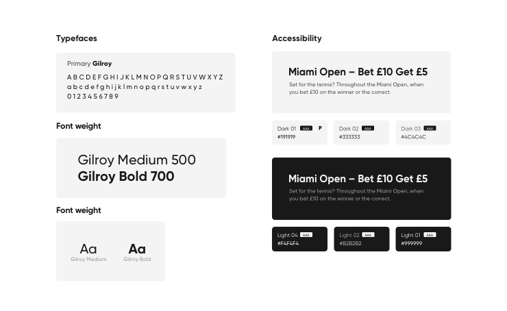
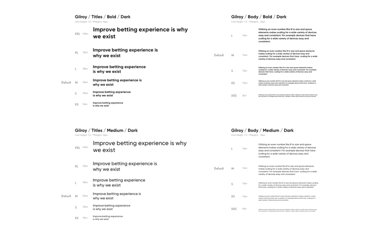
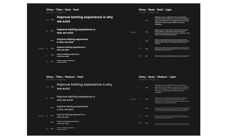
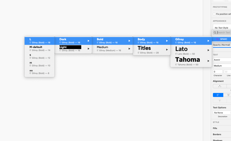
Typography was one of the issues that the team could get right. Before the system, we had typeface selected but there were no rules regarding sizes and when to use them. By applying font scale for sizes and line spacing we were able to create a set of styles that was easy to use and generated consistency across all projects.
Layout & Baseline Grid
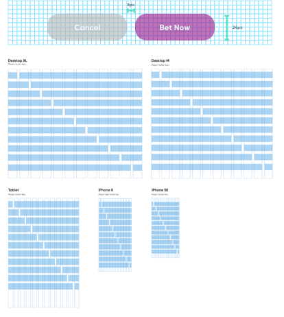
Creating a grid was one of the hardest tasks, mainly because there were no clear answers to what is the best solution. We decided to follow an 8px spacing system. This way all layouts were scalable (8,16,24 and so on). This approach gave us consistency and equal balance in all screens we created. Crating column layout was much easier we just had to keep in mind the 8px spacing rule.
MOLECULES
System Elements
After defining all the basics. Time has come to use them and create reusable elements like buttons, icons, input fields and error messages.
Buttons
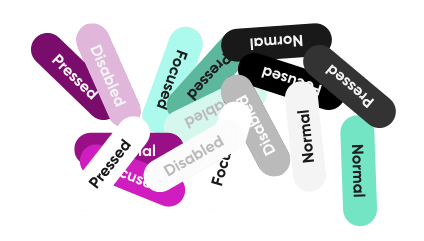
Buttons were the first element we wanted to get in order. It was our biggest issue discovered during the audit. With all the atoms created it was just a formality to add the pieces together. We had 4 types of buttons: full, outline, text button and text links. All followed the 8px scale. for naming, we use t-shirt sizes.
Icons
To have a consistent icon system we had to create a universal grid, equal strokes, geometry and angles. All icons followed 8px gride and were scalable based on these principles
Messages & Inputs
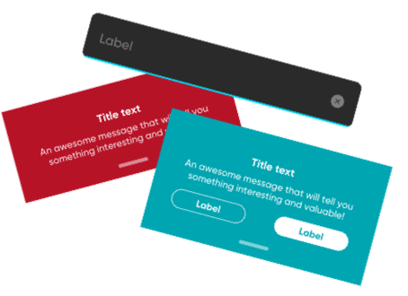
From elements where one of the complexed elements we created for the DS, they have a multitude of options and some of them serve a double purpose. This was an idea one element for multi-purposes. The same we can say about system messages where you used only one element and change the styles to achieve the result you wanted.
Next Project
Mansion Cross NEwProject type

DAZNBetProject type
Leadership PrinciplesLeadership Approach

Teams RitualsLeadership Approach

How to build a great team?Leadership Approach
Design Leadership in ActionCase Study

Org TransformationLeadership Approach
MansionCase Study
MoPlayUX/UX Design
Save Your Plants AppUX/UX Design
MirrorUX/UX Design

Visual System for Markets.comDesign system
Dribbble ShotsProject type
HandsProject type
Blast from the pastProject type

