Mansion Design Milestones
A cross section of all the major design intitative that we had plesure to work with.
In this article, I will share some of the amazing projects that I and my team worked on as a Head of UX. I was involved in leading and contributing to all of these projects, which are the result of the collective work of many talented designers. At Mansion, we valued teamwork and ownership of the design. I am very proud of what we accomplished and I hope you enjoy reading about each project and the story behind it.
SHOW CASE 1/4
Entry Page Redesing - Giving a Second Life
Role
Head of UX, Lead Designer, Reasercher
Overview
The entry page was an internal name for the main landing page for our brands. The aim of the website was to attract and convert visitors.
The old version was outdated and ineffective. The page metrics showed poor performance. The user's research revealed many flaws when we decided to work on the new improved version.
One of the objectives was to create a template that would suit many localisations and brands.
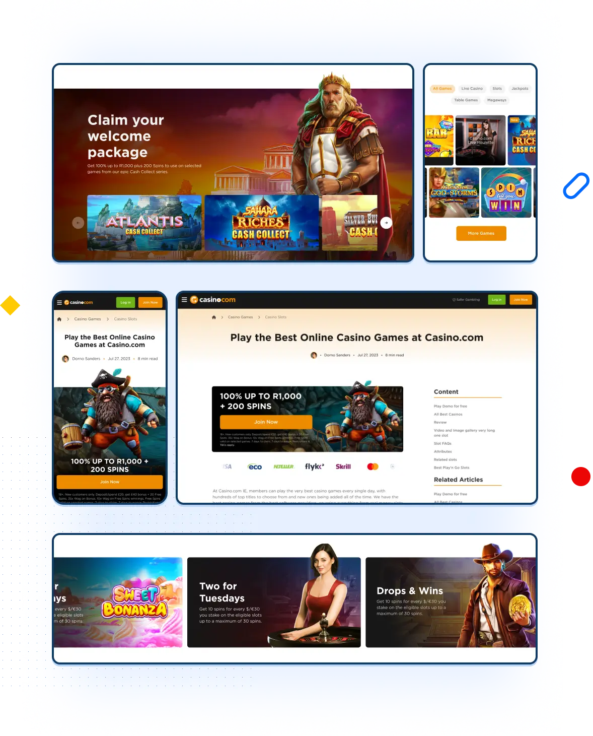
Project Highlights
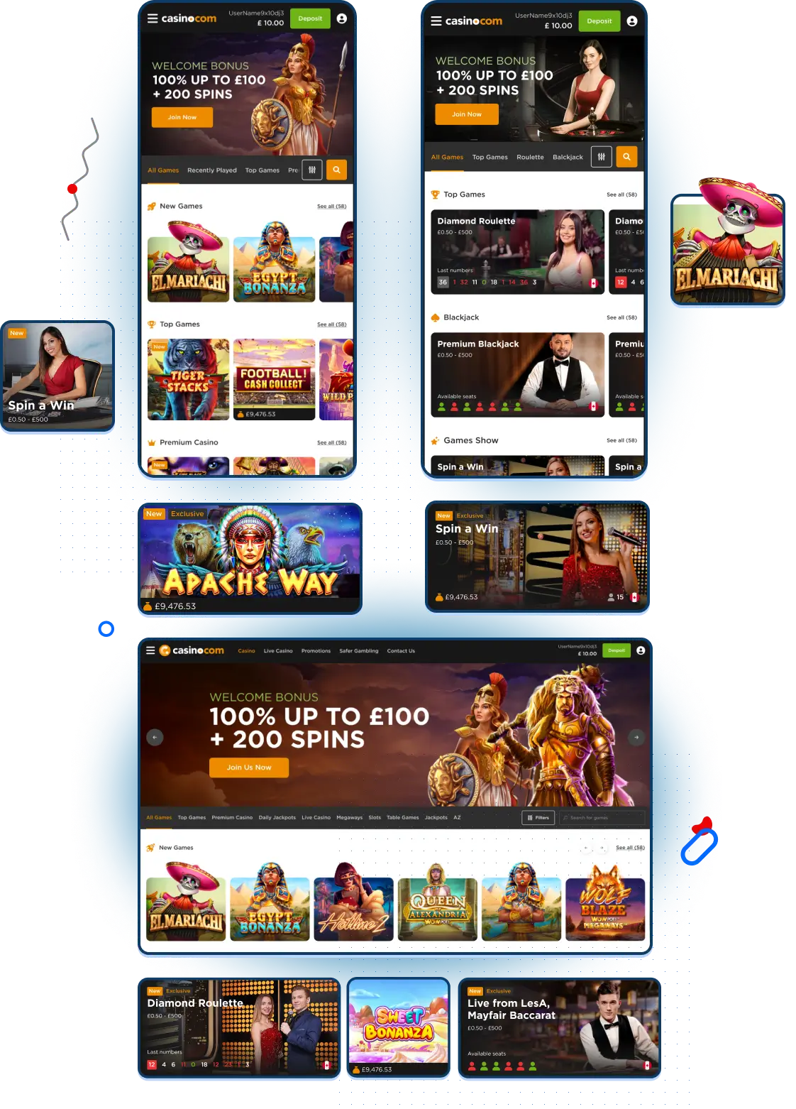
The page underwent a complete overhaul. We spent many days brainstorming, researching and designing the best versions possible. This project is a fruit of work from many departments. Many stakeholders were involved in its creation. We took inspiration from the top entertainment websites like Apple TV and others. The aim was to add more movement and entertaining aspects to the page.
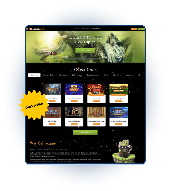
Previosue verion
Since I joined it was an easy target to be sent for user testing. It had many UX issues and the users' feedback revealed a lot of problems that our organisation needed to address. After we implemented the changes, the users' feedback improved dramatically.
Design Journey
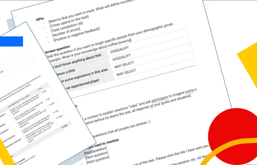
This Initiative faced many challenges from the start. The website was a crucial SEO driver. It accounted for 60% of our total traffic. Many departments were reluctant to make any changes there as they feared the risk was too high for them. We handled this topic very cautiously and transparently. We collaborated with all the key stakeholders from the beginning and gradually persuaded them to embrace the change. We conducted many usability tests before even initiating the conversation to be fully prepared. Once we got a tentative approval, we started with basic wireframes, internal review sessions, and usability testing from the start. We learned new things and adapted at every step.
The new approach was effective from the start. We witnessed the project evolve rapidly. It felt like a gift. We documented our process extensively and here are some examples from that time.
Research techniques: Usability, User interview, Heatmaps, Design survey and Desk research.
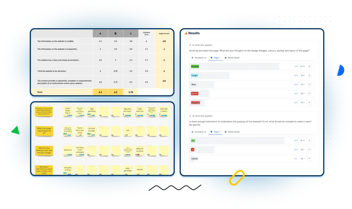
Key takaways
The conversion rate increased by 15%
The SUPR-Q score improved from 3.2 to 4.3
The new look received positive feedback from 73% of the test participants
80% of them said they would join the casino
The page was perceived as clear and informative, containing all the information needed to sign up
The elements that boosted the conversion were: trust elements like awards and safer gambling, game jackpots, payment methods and game varieties
SHOW CASE 2/4
Casino.com Native App - Redesign
Role
Head of UX, Mentor.
Overview
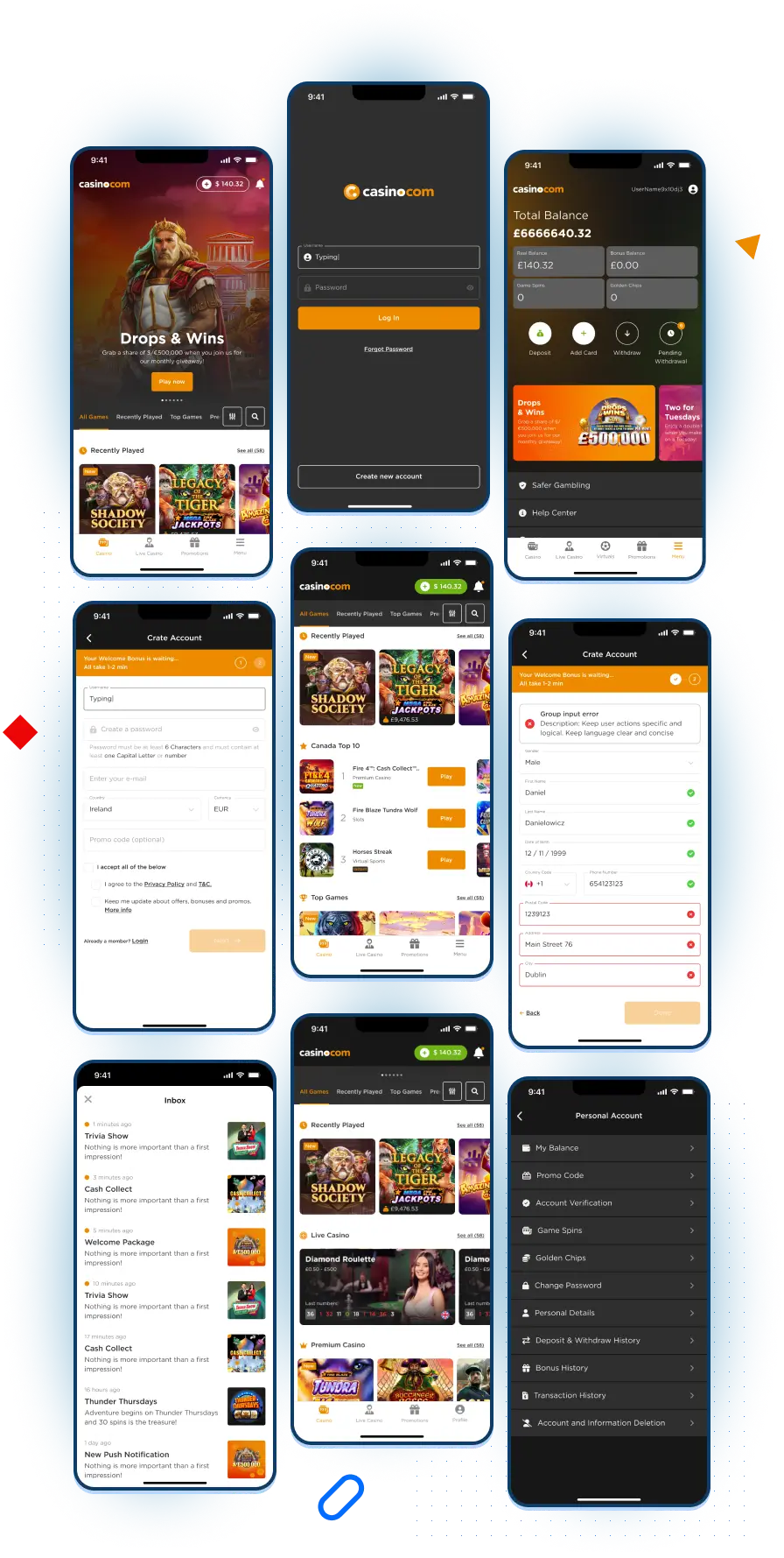
As part of our mobile strategy, we aimed to enhance the visual appeal and user experience of various screens and components within the Casino.com native app.
This initiative involved several key improvements, such as updating all the main screens. We have revamped the app navigation, added a modern casino lobby look, improved banners, registration page and settings.
Project Highlights
We followed the agile framework for this project. As part of the mobile strategy, we were key stakeholders and assigned different areas of the app to change. We prioritized them based on impact and effort. Our main objective was to improve app performance and deliver the best casino lobby possible.
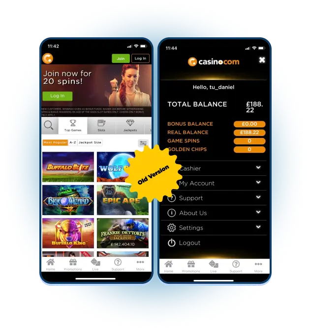
Previosue verion
The image on the right is the previous version of the Casino.com app, which has been managed by the developer's team in the past. The old app had several UX issues, ranging from outdated visuals to logical errors. Definitely was not user-friendly.
The app development involved extensive usability testing to optimize the design. This was a crucial step for the business and we consulted with many key stakeholders throughout the decision-making process. Our innovative UX solution was backed up by rigorous user research that supported all our choices in the process.
Research techniques: Usability, User interview, Heatmaps, Design survey and Desk research.
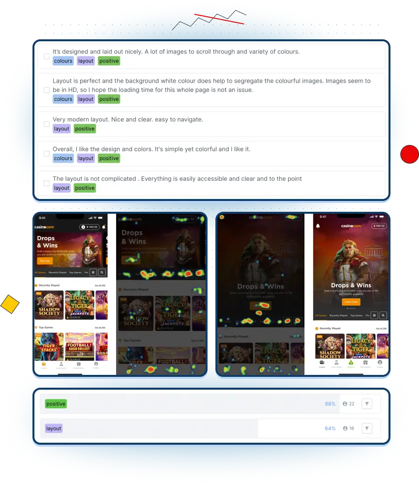
Key takaways
The transition from the HTML wrapper to a fully native app
- Significant performance improvement: lunch time from a few seconds to instant
- User satisfaction improve, 88% positive comments
- 4.4 Rating in the AppStore and Trustpilot.
SHOW CASE 3/4
Casino Lobby - How we improved the user experience and conversion rate
Role
Head of UX, Delivery and supervision, designer
and researcher.
Overview
Improving the UX and UI of our product was a key objective for me. The current version wasn't meeting user's needs and was neglected for a long time. The completion was ahead with more modern implementations.
We worked closely with external consultants who supported me and my team with valuable guidance and support.
This was a huge undertaking that involved all the departments in our organization. I wanted to create the best lobby possible within the given timeframe, and that's what we achieved.
Project Highlights
The casino lobby is the most essential page for the casino, as it is where users can explore, discover and choose games. We wanted to make it a fast, easy and personalized experience, based on our research. Our goal was to create a page that would offer fun and relaxation to our visitors. We tested many versions of the lobby and decided on a carousel-based design, as it performed best on the usability tests. We had two main pages: the slots page and the live casino page with live dealers. The live casino page had more interactive cards that showed live streams from the games, to increase the connection with the users.
Previosue verion
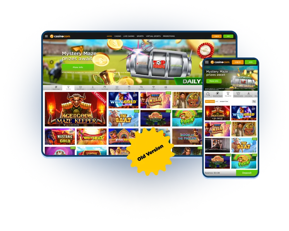
As we can see on the right, the previous version had some major flaws. The main problem was that it did not have any segmentation and it displayed a lot of games in a cluttered way. This overwhelmed the users and made it difficult for them to differentiate between the games. They also struggled to find what they wanted because there were no categories to filter the games.
Reaserch artefacts
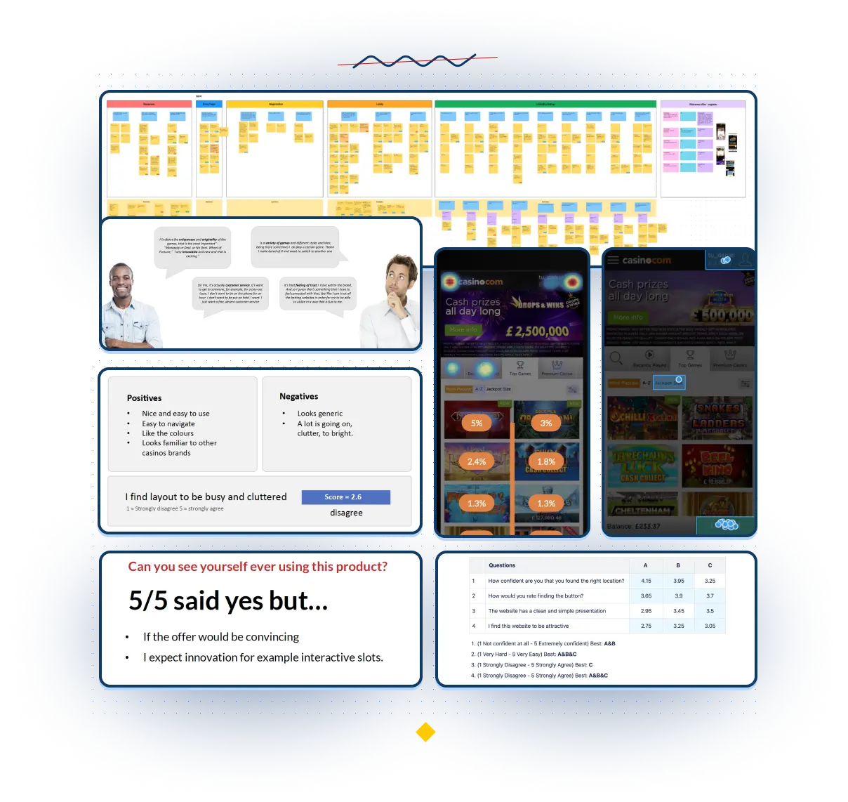
During the user research, we focused on decoding users' needs. We identified several user segments with distinct characteristics. We designed a tailored experience for each segment and tried to offer the best design solutions possible. Our testing revealed that users wanted a fast and easy platform with engaging content. They wanted something that would catch their eye and keep their interest. The research challenge was that we had to conduct it in multiple languages such as Spanish, Portuguese or Finnish. We ended up with a great lobby platform ready for future developments and enhancements.
Research techniques: Usability, User interview, Heatmaps, Design survey and Desk research.
Key takaways
User time spent in the lobby decreased, indicating better discoverability and faster decision-making
More games and segmentations were added to enhance user choice and engagement
SUPR-Q score remained at 4.2 level, reflecting high user satisfaction and loyalty
User feedback was mostly positive and highlighted the improved user experience and lobby design
Games pods use live API data, which is an innovative and competitive feature in our industry
Designer's work time was optimized by reducing the number of game pod sizes, resulting in more efficient and consistent design
Modern UX and UI improved the conversion rate on the website, generating more revenue and growth
SHOW CASE 4/4
Landing Pages Templates
Role
Head of UX, delivery and supervision, designer
and researcher.
Overview
Casino landing pages are crucial for attracting and converting potential customers. Its job is to get quality clicks and send users through the funnel. However, the previous version of our landing pages had poor performance, UX problems and internal difficulties.
Designers had to create many images for different screens and the CMS team had to deal with the limitations of the previous version.
We decided to redesign our landing pages to meet the needs of our customers and our departments. We wanted to create landing pages that would work for everyone and reduce production time and costs.
Project Highlights
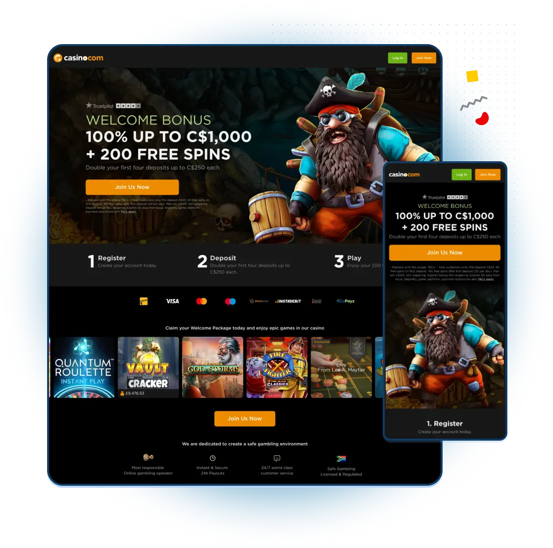
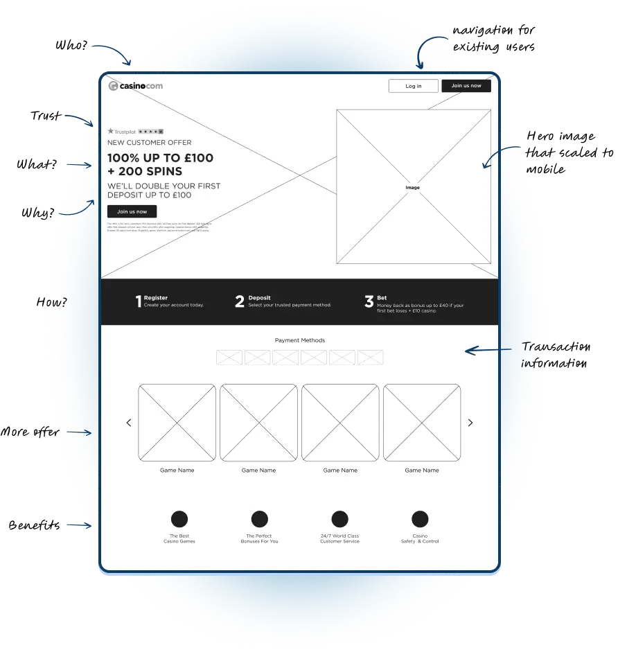
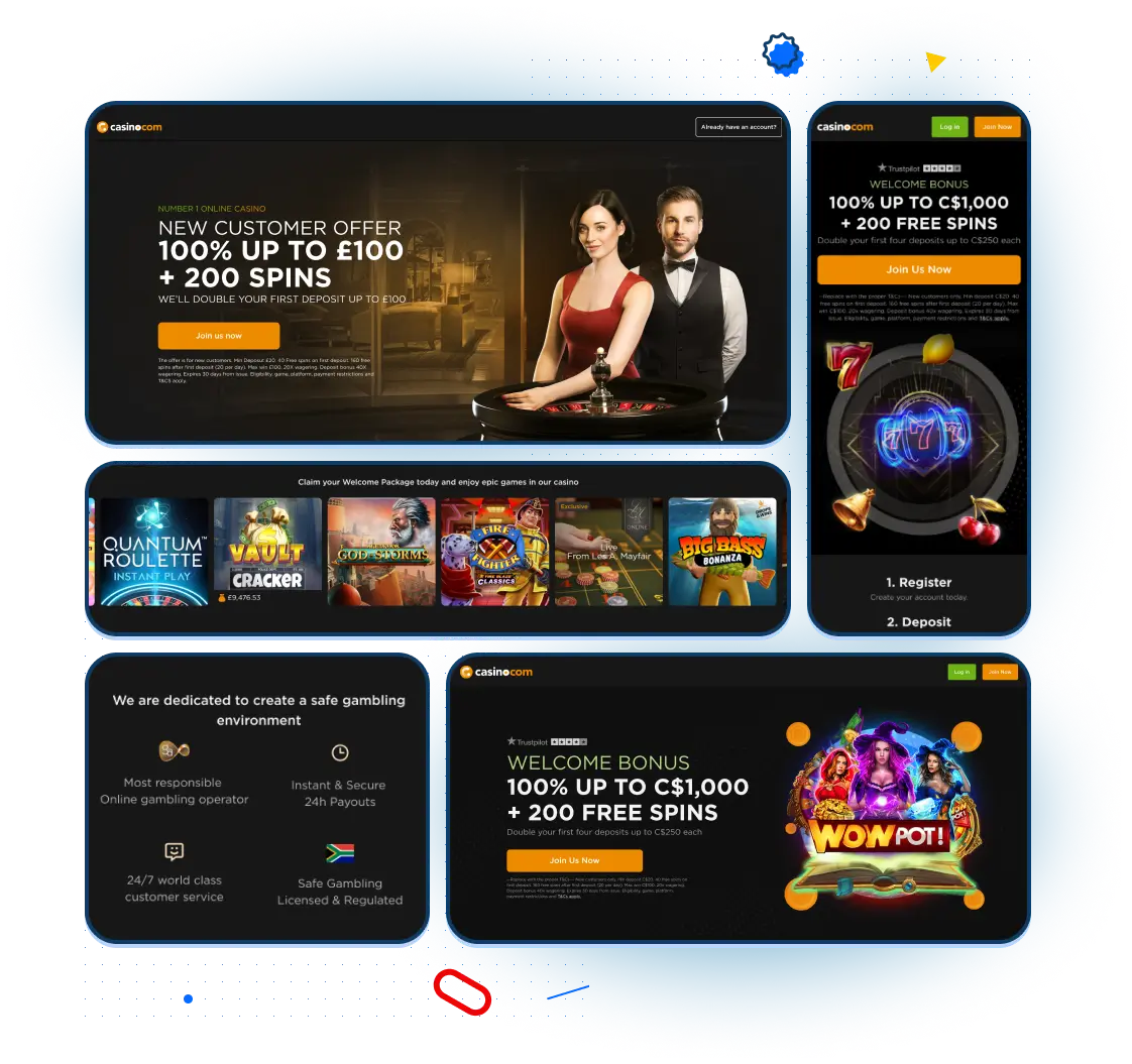
We collaborated as a team on this project, with one of our Product designers taking the lead role. I contributed to the process and communications and also designed some elements. We kept in touch constantly to ensure a smooth workflow. We used wireframes to create an initial structure and define the templates. Our goal was to achieve maximum flexibility. Our research discovered that trust was the main factor for visitors.
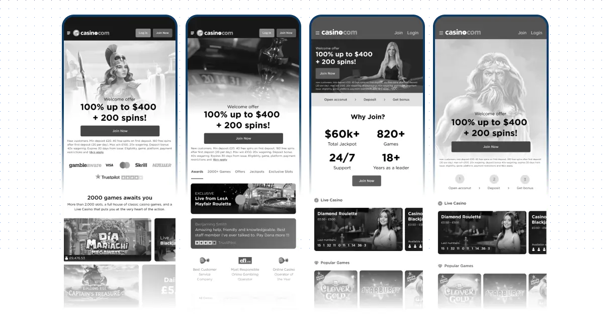
Previosue verion
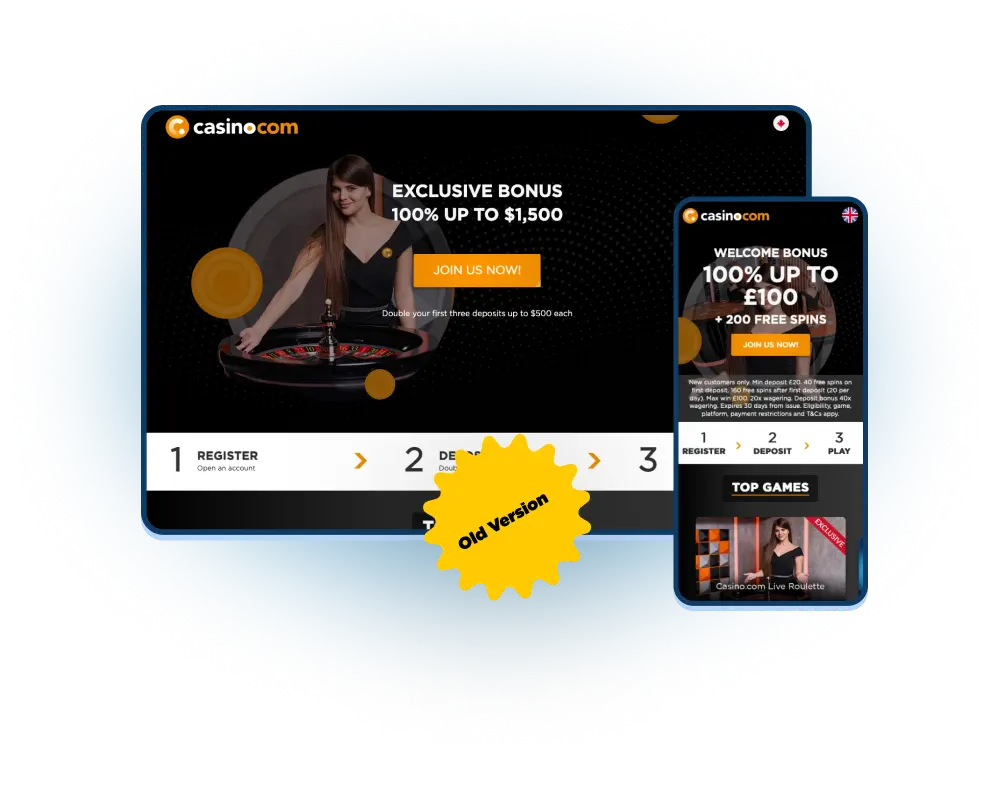
As we can see on the right, the previous version had some major flaws. Especially mobile version was not optimal and the text was overlapping with the campaign image. There was no way around it to star all over and redesign.
Reaserch artefacts
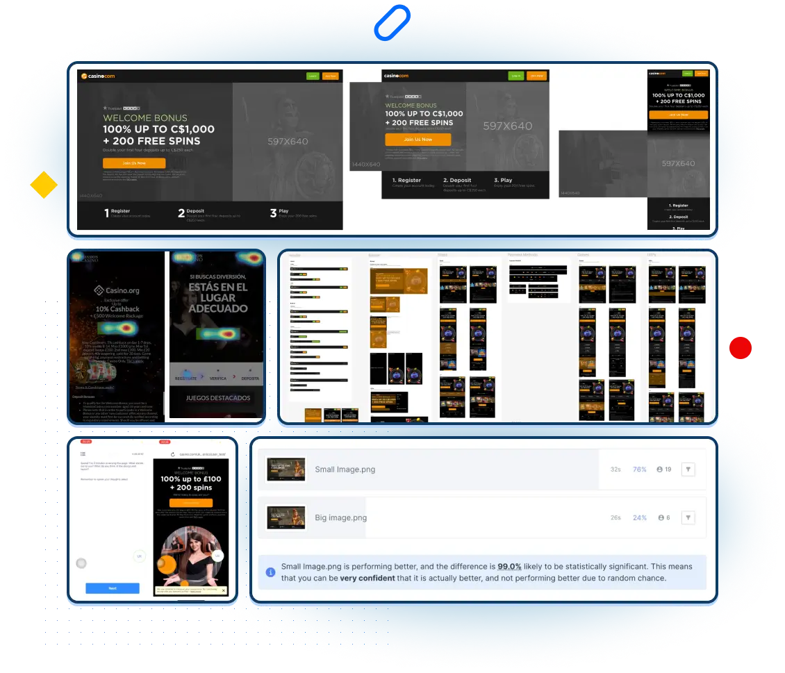
We conducted several research cycles with our initial wireframes, validating and discovering new things each time. We used data from analyses and heat maps to gain insights about the previous pages. We also did a competitor's audit to understand the industry standards. Then we created and tested a few versions until they met our criteria. Finally, we worked on the documentation and template adaptations.
Research techniques: Competitor research, Usability, User interview, Heatmaps, Design survey and Desk research, AB test.
Key takaways
- Templates used only 2 images (background & hero image)
- It reduced design time by 50%
Thank to improvements form the test we imprest the trust of and conversion for the new cusumers
- The CMS team got a flexible template that allowed them to produce new landing pages for all the brands very fast
Next Project
DAZNBetProject type
Leadership PrinciplesLeadership Approach
Teams RitualsLeadership Approach
How to build a great team?Leadership Approach
Design Leadership in ActionCase Study

Org TransformationLeadership Approach
MansionCase Study
MoPlayUX/UX Design
Sparc* Design SystemUX/UX Design
Save Your Plants AppUX/UX Design
MirrorUX/UX Design
Visual System for Markets.comDesign system
Dribbble ShotsProject type
HandsProject type
Blast from the pastProject type

